
Save This Recipe
Most of us have held a Solo Cup at some point—at a backyard cookout, a tailgate, a graduation party, maybe just standing around someone’s kitchen island talking long after dinner should’ve ended. It’s one of those objects that almost disappears because it’s so familiar. You grab one, fill it, set it down, forget which one is yours, grab another. Life happens.
But here’s a funny thought: what if one of the most recognizable party staples in America has been quietly hiding a clever little secret this whole time?
Turns out… it kind of has.
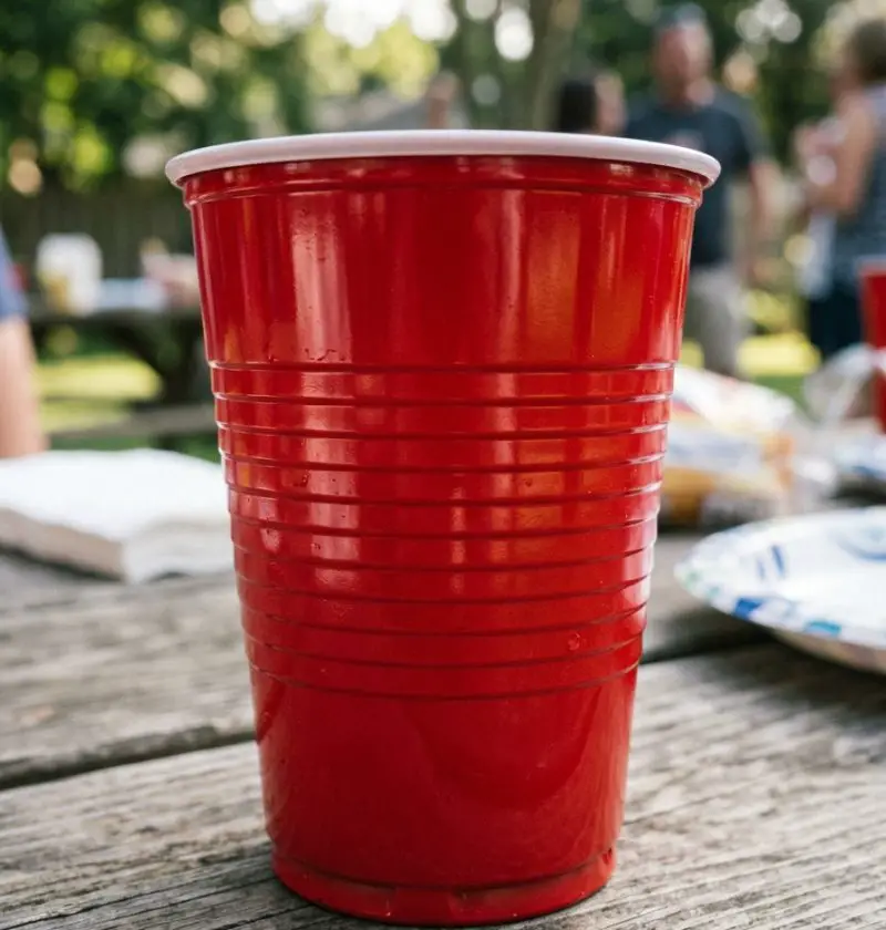
Those horizontal ridges wrapping around a red Solo cup? They aren’t just there to make the cup look nice—or to give your fingers something to grip while balancing a burger in your other hand. A lot of people believe those lines double as informal measuring guides. And honestly? Once you notice it, you can’t unsee it.
It’s one of those tiny design details that makes you stop and think, Wait… how did I never know this?
The Cup That Somehow Became a Cultural Celebrity
Not many disposable products become icons. Yet somehow the red Solo cup did.
The story starts with Leo Hulseman, who founded the Solo Cup Company in the 1930s. The company started with pretty humble products—paper cones for water coolers. Nothing glamorous.
Then came the plastic party cup.
By the 1970s, the red version started showing up everywhere. And I mean everywhere.
College parties? Obviously.
Neighborhood barbecues? Of course.
Fourth of July cookouts, block parties, tailgates, family reunions… somehow that bright red cup became part of the scenery.
And maybe that’s why people rarely question its design. It feels too ordinary to hide surprises.
But ordinary objects often do.
Those Lines Aren’t Random—Well, Not Entirely
Let me explain.
There’s a long-running belief—part practical joke, part useful party wisdom—that the ridges on a standard red Solo cup correspond loosely to drink portions:
- Bottom line: roughly 1 ounce (a pour of spirits)
- Middle line: around 5 ounces (a wine serving)
- Upper line: about 12 ounces (beer or soda)
Convenient, right?
Almost suspiciously convenient.
Now, to be fair, these markings weren’t officially engineered as precise bartending measurements across all cup versions. Different cup models vary, and even Dart Container has indicated the ridges weren’t designed as certified measuring marks.
Still… people use them that way. And they work well enough that the myth stuck.
And honestly? Sometimes folklore hangs around because there’s truth hiding in it.
A Party Hack Hiding in Plain Sight
Think about a crowded party.
Nobody’s pulling out a measuring jigger.
Nobody’s saying, “Excuse me while I precisely portion this merlot.”
You eyeball it.
And these lines make eyeballing easier.
That’s clever design—even if partly accidental.
It reminds me of the little indent on a wine bottle punt. People argue about what it’s for all the time. Stability? Sediment? Fancy tradition? Sometimes a design feature does more than one thing.
Same idea here.
The cup quietly helps.
No fuss.
No instruction manual.
Just a little plastic nudge.
Honestly, It Can Help With Responsible Drinking
And this part matters more than people realize.
Knowing what roughly counts as a serving can help people keep track.
Not in a preachy way.
Just practically.
If the lower ridge gives you something close to a shot pour, and the middle helps with wine, that makes moderation easier without turning a casual gathering into chemistry class.
That’s useful.
Especially because party culture and overpouring often go hand in hand.
You know what? Sometimes the simplest tools are the ones people actually use.
And a cup you already have in your hand qualifies.
But Those Lines Do More Than Measure
Here’s where it gets even more interesting.
The ridges also strengthen the cup.
Take a plain thin plastic cup with smooth sides—it flexes more.
Add rings and grooves?
You increase structural rigidity.
That means:
- Better grip
- Less collapse when squeezed
- Easier stacking
- More stability on tables (well… relatively speaking)
It’s a little bit engineering, a little bit manufacturing efficiency.
Kind of wild for something usually sitting next to a bowl of chips.
And yet there it is.
Why Almost Nobody Notices
Because familiarity blinds us.
Seriously.
Psychologists talk about this all the time—we stop seeing details in things we encounter constantly.
Door handles.
Coffee lids.
Paper clips.
Solo cups.
We register function and move on.
Plus, nobody markets the cup by saying:
“Now featuring hidden beverage calibration ridges!”
That would be… a strange ad.
So the detail stays hidden in plain sight.
Which almost makes it more fun.
And Then There’s the Cultural Mythology
The red Solo Cup is bigger than plastic.
It became shorthand for a whole mood.
Casual fun.
Summer nights.
Backyard lights strung over a patio.
Country songs blaring.
There’s even Red Solo Cup, which basically turned a disposable cup into a pop-culture character.
That doesn’t happen by accident.
Objects become symbols when people attach memories to them.
And the cup has decades of memories soaked into it.
Messy ones.
Funny ones.
Some maybe best left untold.
That matters.
Design and culture tend to feed each other.
The object works well, so people use it.
People use it, so it becomes symbolic.
Then its smallest details start carrying stories too.
Even the little ridges.
The Funny Thing? It May Be Part Myth… and Still Useful
Here’s a mild contradiction—and it’s worth saying out loud.
Are those lines officially standardized measuring marks?
Not exactly.
Can they still work as rough serving guides?
Absolutely.
Both things can be true.
And honestly, that makes the story better.
Because it isn’t just a hidden “secret” uncovered.
It’s part practical feature, part cultural legend.
Very American, really.
A little utility.
A little folklore.
A little party wisdom passed around.
What Everyday Objects Are We Missing?
That’s maybe the bigger takeaway.
How many ordinary things have smart details we ignore?
The notch in a gas gauge icon telling you which side the fuel door is on.
The hole in a spaghetti spoon measuring portions.
The arrows under the “1” in the recycling symbol meaning something.
Stuff hides in plain sight all the time.
We just stop looking.
And maybe that’s why the red Solo cup story is weirdly charming.
Because it reminds you design can be playful.
Thoughtful.
Even sneaky.
So… Next Time You Hold One
Take a second.
Look at those ridges.
Maybe use them.
Maybe point them out to someone and blow their mind a little.
That’s worth something.
Because the humble red Solo Cup turns out to be more than party clutter.
It’s a tiny piece of industrial design, cultural history, and maybe—just maybe—a built-in bartender.
Not bad for a disposable cup.
And honestly?
That makes me like it even more.